Royalty and Spirituality

Purple is royalty. A mysterious
color, purple is associated with both nobility and spirituality.
The opposites of hot red and cool blue combine to create this intriguing
color.
Deep or bright purples suggest riches while lighter purples are
more romantic and delicate. Purple is associated with creativity
and moodiness, perhaps because of the conflicting red and blue base.
A deep eggplant purple with neutral tans or beige is an earthy,
conservative color combination with a touch of the mystery that
purple provides.
Purple has a special, almost sacred place in nature: lavender,
orchid, lilac, and violet flowers are often delicate and considered
precious. Purple might suggest something unique or extremely special,
but with an air of mystery.
Lavender has long been a favorite flower and color of genteel ladies.
This shade of purple suggests refinement. Lavender may be a good
choice when you are targeting women and want to invoke feelings
of nostalgia or romance.
• Purple
Goes With...
Take a look at purple on the color wheel.
• Harmonizing colors for purple: Magenta
and Blue
harmonizing colors (adjacent) often work well together but if too
close in value they can appear washed out or not have enough contrast
• Complementary colors for purple: Dark
Pink and Medium Blue
complementary colors printed side by side can cause visual vibration
making them a less then desirable combination
• Opposite color for purple: Green
colors that are opposite each other on the color wheel are said
to clash — not always a bad combination if used carefully
• Purple
Color Combos
These color palettes feature shades of purple. Although I've made
a few suggestions here and there about the 'amount' of each color
to use, experiment. For best results don't use even amounts of each
color in the palette. Choose one or two dominant colors and use
the rest for accents. Keep in mind that due to the differences between
color in print and on the Web that these colors may not appear the
same on paper as they appear here on the screen.
These aren't just random color combinations. Each of these are
based on actual historic and modern formulas used in posters, packaging,
ads, and other design work over the past century. For a much more
comprehensive selection of color combinations refer to The Designer's
Guide to Color Combinations by Leslie Cabarga.

C40M5Y30 | C100M15Y80 | C50M30 | C67M75Y10K13 |
C80M55 | C40K100 | White
Opposites of purple and green make an attractive match with black
and white added to the party.

C70M5Y100 | M100Y100 | C53M100 | White
Throw a reddish orange in the middle of green and purple.

C35M50Y25K25 | M35Y35K3 | C30M35K25 | C80M30Y5K15
These dusky shades of purple, pink, and blue have an earthy tone.

C23M20Y25 | M53 | C35M85 | C50Y90 | C60M100K10
Relive the sixties with these pretty pinky purples and yellowish
green.

C60M100 | C30M50 | C15M25 | C70M50Y25K10 | C100M85Y35K15
| C40M20Y10K5
Show your passion for purple with this selection of purples and
blues. (Notice the formulas for the purples, each half of the one
before it)

C80M75K10 | M35Y85 | M15Y35 | White
Golden yellows pops when placed on a background of purple. (Yes,
it looks bluer on the Web but it really is purple in print.)

C50M60 | C100M20K20 | C15M50Y55 | White
This peachy palette includes a mild purple and medium blue.

Y100 | M100 | C30M100K13 | C100M100
No shrinking violets here.
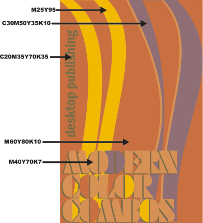
A modern mix of peach, orange, yellow, and dusky purple. [See more
Current/Modern Color Palettes]
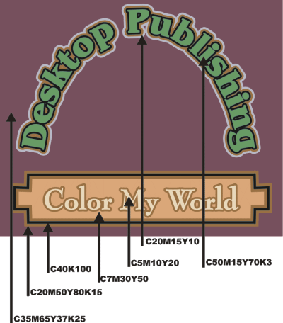
Deep purple, green, and browns show the typical Victorian era use
of many colors - 7 here.
|

