Life and Renewal

Green is life. Abundant in
nature, green signifies growth, renewal, health, and environment.
On the flip side, green is jealousy or envy (green-eyed monster) and
inexperience.
Green is a restful color with some of the same calming attributes
of blue. Like blue, time moves faster in a green room.
With both a warming and cooling effect, green denotes balance,
harmony, and stability. Green with blue produces echoes of nature
-- water and forest and can denote new beginnings and growth. Green
with tan or beige says 'organic' or 'recycled.' Green can convey
quiet contemplation. In the U.S. green is money and good luck.
Green is associated with Spring and (when combined with red) Christmas.
For designers, it important to remember that for all the positive
attributes of green there are many strong negatives or opposites
associated with the color as well. Know your audience before using
green. Teal, a mix of blue and green, is a bit livelier than either
color alone. It carries a touch of sophistication and richness.
• Green
Goes With...
Take a look at green on the color wheel.
• Harmonizing colors for green: Cyan and
Yellow
harmonizing colors (adjacent) often work well together but if too
close in value they can appear washed out or not have enough contrast
• Complementary colors for green: Blue and
Red
complementary colors printed side by side can cause visual vibration
making them a less then desirable combination
• Opposite color for green: Magenta
colors that are opposite each other on the color wheel are said
to clash — not always a bad combination if used carefully
• Green Color
Combos
These color palettes feature shades of green. Although I've made
a few suggestions here and there about the 'amount' of each color
to use, experiment. For best results don't use even amounts of each
color in the palette. Choose one or two dominant colors and use
the rest for accents. Keep in mind that due to the differences between
color in print and on the Web that these colors may not appear the
same on paper as they appear here on the screen.
These aren't just random color combinations. Each of these are
based on actual historic and modern formulas used in posters, packaging,
ads, and other design work over the past century. For a much more
comprehensive selection of color combinations refer to The Designer's
Guide to Color Combinations by Leslie Cabarga.

C100Y100K50 | K40 | C10M25Y80 | C40K100 | White
The harmonizing colors of green and yellow are accompanied by black
and white.

C65Y100 | C40K100 | White
A grassy green with nothing but black and white.

C65Y100 | C40K100 | White
A pale green with nothing but black and white.

C100M70Y90 | C80M30Y50 | C60M10Y50
Three shades of teal form this monochromatic palette.

C23M20Y25 | M53 | C35M85 | C50Y90 | C60M100K10
Relive the sixties with these pretty pinks and a yellowish green.

C70M5Y100 | M100Y100 | C53M100 | White
Red and green isn't just for Christmas. Make it an orangy red and
throw in a dash of purple and white for a vibrating sixties color
scheme.

C25M80Y90Y25 | C65M3Y65K15 | C5M85Y90 | C5M55Y85
| M20Y40 | C40K100
An earthy palette of brown, green, and orange.

C40M75Y80 | M10Y35 | C40Y70K10 | C100Y50
Shades of brown and tan are enlivened with a bright teal.
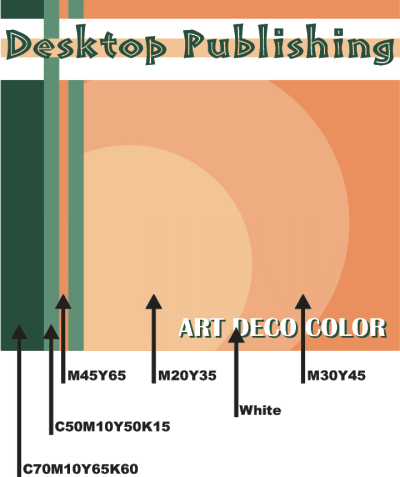
Tints of peach and green team up for this Art Deco era combination.
|

