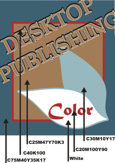
Calm and Cool

Blue is calming. A natural
color, from the blue of the sky, blue is a universal color. In many
diverse cultures blue is significant in religious beliefs, brings
peace, or is believed to keep the bad spirits away.
The cool, calming effect of blue makes time pass more quickly and
it can help you sleep. Blue is a good color for bedrooms.
A deep royal blue or azure conveys richness and perhaps even a
touch of superiority. Navy blue is almost black. It conveys importance
and confidence without being somber or sinister, hence the blue
power suit of the corporate world and the blue uniforms of police
officers. Long considered a 'corporate' color, blue is associated
with intelligence, stability, unity, and conservatism.
Combine a light and dark blue to convey trust and truthfulness
— banker's colors. Mix blue with green for a natural, watery palette.
Lighter sky blue and robin's egg blue, especially when combined
with neutral tans or beige are environmentally friendly color combinations.
Although blue is a year-round color, pastel blues, especially along
with pinks and pale yellows suggest Spring. Throw in a dash of blue
to cool down a hot red or yellow scheme. Or warm up a blue palette
with a dash of attention-grabbing red.
• Blue Goes With...
Take a look at blue on the color wheel.
• Harmonizing colors for blue: Magenta and
Cyan
harmonizing colors (adjacent) often work well together but if
too close in value they can appear washed out or not have enough
contrast
• Complementary colors for blue: Red and
Green
complementary colors printed side by side can cause visual vibration
making them a less then desirable combination
• Opposite color for blue: Yellow
colors that are opposite each other on the color wheel are said
to clash — not always a bad combination if used carefully
• Blue Color Combinations
These color palettes feature shades of blue. Although I've made
a few suggestions here and there about the 'amount' of each color
to use, experiment. For best results don't use even amounts of each
color in the palette. Choose one or two dominant colors and use
the rest for accents. Keep in mind that due to the differences between
color in print and on the Web that these colors may not appear the
same on paper as they appear here on the screen.
These aren't just random color combinations. Each of these are
based on actual historic and modern formulas used in posters, packaging,
ads, and other design work over the past century. For a much more
comprehensive selection of color combinations refer to The Designer's
Guide to Color Combinations by Leslie Cabarga.

C90M50K30 | C70K25 | C10K40 | C100K40 | C100M90Y90
These blues and gray create a dark, conservative look.

C100M75 | C80M5Y10 | C65M3Y10 | C15Y5 | M40Y75 |
C100M50 | C40K100 | White
Brighten this combo of shades of blues with a dash of orange.

C100M40 | M47Y100 | C10M95Y5
Shades of the sixties with blue, orange, and pink.

M50Y100 | C100M37K15 | C25M10K4 | White
Vary the look here by using orange as the accent or the medium blue
as the accent.

C60M20Y5K10 | M75Y80 | White
It's still orange and blue but with a more subdued look. A dash
of bright white keeps it from being too subdued.

M9Y45K5 | C95M80Y30K15 | C45M40Y10K5 | M80Y100
More attraction between yellow and blue (both a light and a darker
blue) with a dash of orange thrown in.

C60M100 | C30M50 | C15M25 | C70M50Y25K10 | C100M85Y35K15
| C40M20Y10K5
Show your passion for purple and your bias toward blue with this
cool color palette.

C35Y7K3 | C55Y10K5 | C80Y15K7 | C100Y20K20 | Y100
| M40Y35 | C40K100
Accent these blues with a dash of yellow and pink.

Brown joins blue-green shades in this color palette of the Atomic
Age.

Eight - count 'em - eight brights and browns make up this nature-inspired
palette - including a bright and a light blue.
|


